Better Build
App for efficient and productive collaboration for contractors
Product Type
End-to-End Mobile App,
3 weeks / 100+ hours
Client
General Contracting Project Manager
My Role
User Experience Design, User Research & Interviews, Prototyping, User Testing, Iteration, Branding
Tools
Figma, Illustrator, Otter.ai, Photoshop, Google Meet, Figjam
Problem
Construction site comms favor project managers, yet supervisors and foremen also need efficient reporting tools to keep the team aligned and informed.
Better Build’s focus is to create an app tailored for users in the field, while enhancing dialogue between foremen and project managers on large construction sites. Through stakeholder and user interviews, I've gained insights into on-site communication flows—and identified space for improvements in coordination, communication, and time-management.
Goal
Together with stakeholders, my goal is to design a mobile app that enables on-site workers to easily report their progress, swiftly address issues, and stay focused on the job.
Solution
I developed a unified platform that streamlines project management for supers and foremen. By integrating tasks, materials, plans, and a centralized chat into one interface per job—plus a time-tracking feature—I delivered a comprehensive tool that meets my users and stakeholders' needs.
Competitive Analysis
Once identifying the gap, I’ve spotlighted the need for a tailored app that serves tradesmen in the field, setting it apart from traditional desk-based solutions.
While the market has numerous feature-rich construction apps, there is a clear demand for simpler mobile tools specifically designed for field workers. Foremen, supervisors, and personnel require interfaces that facilitate easy data entry and efficient communication with their teams and essential contacts.


Analysis Insights
Current field-focused management apps tend toward project managers, underscoring the need for mobile tools that specifically support easy communication and quick reporting for field workers.
Findings highlighted the need for a mobile app for on site teams to easily find vital information, project product lists, and efficient communication.
User Interviews
No matter the scale of a project, tradespeople need an effective collaborative tool to facilitate clear communication, access up-to-date plans, and manage comprehensive material lists.
Through User Interviews, I needed to:
Learn how people communicate on the job site.
Identify trade-specific information needs.
Identify preferred communication methods (call, text, email).
Understand preferred strategies for tradespeople management on the job.
“After a long day I have so many pictures and I need to make sure they all go in the right folders.” -Max, Foreman
User Interview Findings:

100% of participants underscored the importance of clear and easy to find communication on the job, and the necessity for well-documented planning.

All interviewees stressed the need for prompt and efficient task documentation and communication to facilitate a smooth handover to the next foreman or project manager for project continuity.

80% of foremen and project managers indicated that having material lists and plans ready on arrival is key for on-site collaboration and workflow efficiency.

5/5 highlighted the need for clear alerts for flagged, completed, or initiated tasks to ensure timely project progression.
User Interview Insights
The interviews highlighted the need for easy ways to take or share photos per project, locate task tracking, prompt notifications, and find job-specific messaging. The suggestion for multilingual support also emerged as a valuable addition for enhancing communication.
Affinity Mapping
Foreman actions that are key for efficiency:
Task clarity and documentation
On-site material availability
Succinct communication regarding issues and task completion
Key Affinity Map Insights
I learned about the complexity of issues within project management and the need for an app that effectively enables supervisors or foremen to share ongoing updates with the project manager.
From user interviews and the affinity map, I identified three key aspects for effective on-site management: firstly, continuous communication through chat, photos, and notifications keeps everyone informed; secondly, regular inventory checks and material availability; thirdly, access to the latest plans, notes, and markups.
Users Perspective
Imagine tackling a challenging problem with your hands, while also trying to communicate your thoughts at the same time.
This is the scenario that POVs and HMWs helped me thoroughly explore to position Better Build's app development. These methods helped create a solution that would minimize user stress.
Highlighted POV
Jake is working on managing multiple jobs, he needs a streamlined solution to track and review messages specific to each job, ensuring efficient communication and time management.
↓
Highlighted HMW
How might we design a quick and easy system for Jake to track and review messages related to specific jobs amidst managing multiple tasks at the same time?
POV and HMW Insights
These deliverables encouraged me to embody the user's perspective—which I discovered to be an engaging and enjoyable experience. Delving into the user's viewpoint allowed me to more effectively consider and address their needs.
Personas
Users favor an experience were the technology does not become a “second job,” but rather fits into the flow of daily experience.
I explored the needs of someone in the field, then crafted stakeholder-approved personas that aim to incorporate the unique elements that are the most defining characteristics for users of Better Build.
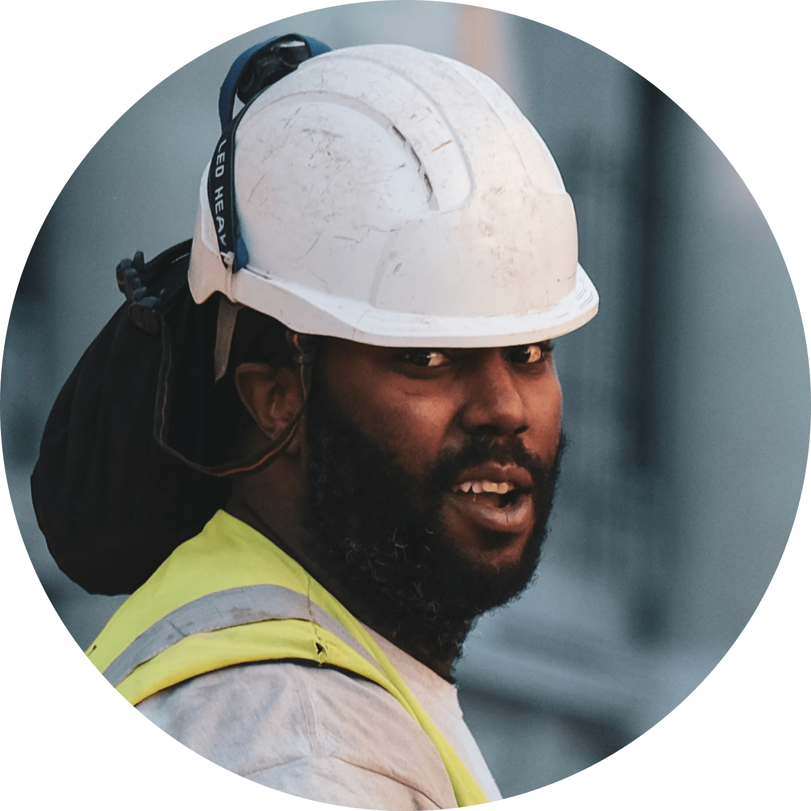
Jake Mason
Age: 39
Education: Bachelors
Status: Married, 2 kids
Occupation: Super
Location: New Jersey
Tech Literate: High

About User
Jake works hard during the week and loves relaxing weekends with his family. He enjoys playing sports with his kids and unwinds by reading or playing video games.
Core Needs and Goals
Clear job requirements upon arrival.
Initial material list for the job.
Awareness of completed tasks by work teams, and to let other teams know when his work is done.
Frustrations
Lack of clarity regarding what work has been completed.
Outdated site plans at times.
Difficulty in reaching the project manager promptly during issues.
“Each project has a lot of moving parts and the right teams need to know what has been done so they are ready to move forward”
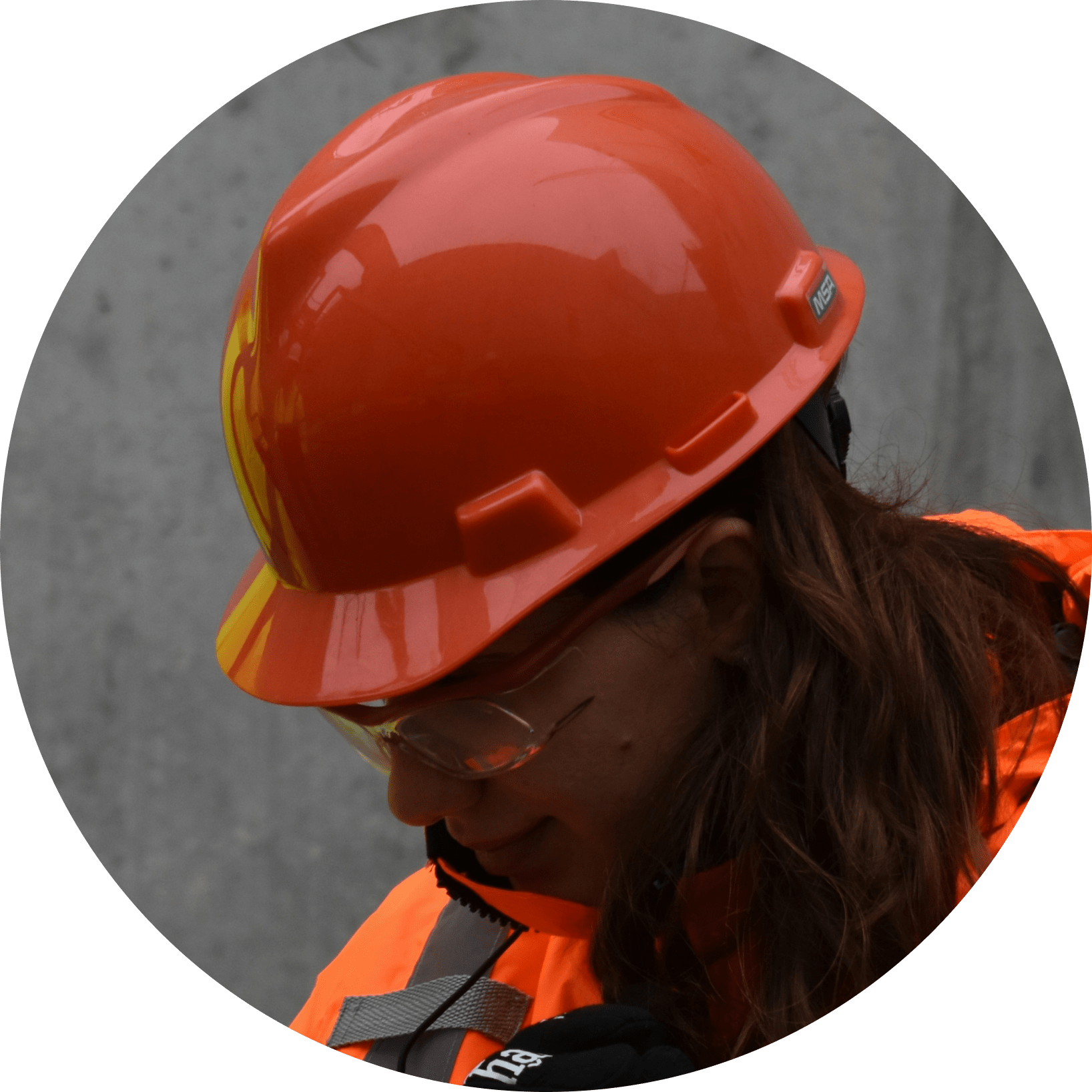
Tiffany Turner
Age: 45
Education: High School
Status: Married, no kids
Occupation: Foreman
Location: Detroit, MI
Tech literate: Moderate
About User
Tiffany began as a crew member, and was rapidly promoted to foreman. Outside of work, she spends most of her extra time woodworking and hanging out with her girlfriend.
Core Needs and Goals
Needs the ability to document the day's work with photos and make notes.
Needs to ensure the inventory is stocked for the next day.
Needs a punch list at the end of a project that she can share with her crew.
Frustrations
Needs a single platform to access all communication with the project manager for specific projects.
Uncertain whether uploaded photos have been received.
Occasionally forgets to take all necessary notes.
"I take a lot of photos, and I have to make sure they are all documented and attached to the right project. Sometimes, there is one house after another, so it's hard to distinguish which photos are for which project."
User Interview Insights
Jake and Tiffany, always-present , informative and supportive, ensure I remain grounded and focused. Their day-to-day on-site interactions, mostly through mobile devices, contrast with my work setup, pushing me to tailor solutions from their perspective. Emphasizing mobile-optimized communication, documentation, and notification systems, my goal is to facilitate seamless information flow. Jake and Tiffany (users personas) represent the information I gathered from user interviews examined with POVs, HMW, and affinity mapping. I am thankful for them keeping me on track!
Interaction Design
In order to create a Minimally Viable Product (MVP), I focused on simplifying communication for crew members of all levels; helping to prevent scope creep and project bloat while ensuring the solution remained functionally focused.
Clearly defining each step of the user flow helped me to focus and facilitate conversation with developers and stakeholders, ultimately improving project outcomes.
A skilled laborer communicating with a project manager
Interaction Insights:
Laying out the sitemap and flows for phase one ensured that I did not leave anything out or complicate tasks.
I found there is a fine line when balancing complexity; I did not want to oversimplify, yet I wanted to ensure that all information the user was seeing and interacting with was useful.
Deduced that my MVP will be centered around communication, planning, and inventory.
Low Fidelity Wireframes
LoFi Wireframes facilitated more open dialogues with stakeholders and users—giving way to identifying which ideas were effective and worthy of further investigation.
In the Lo-Fi Wireframes, I wanted to explore:
an efficient layout for the home screen
ways for users to upload and annotate photos
how users would update the status of tasks
preferences for communication among users
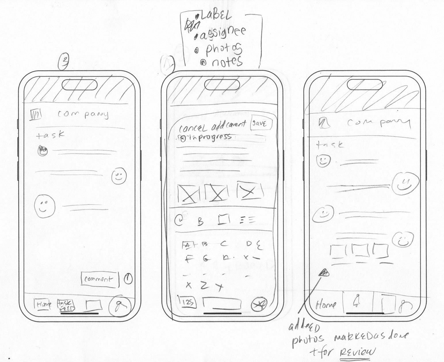
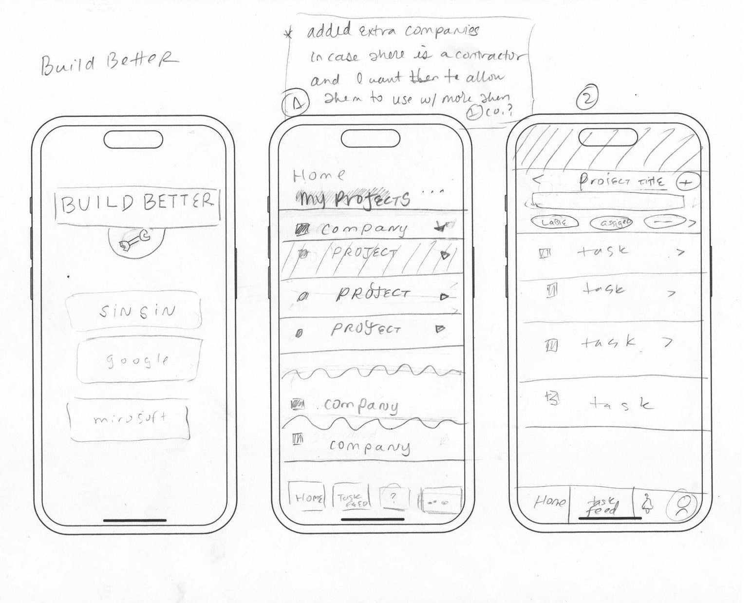
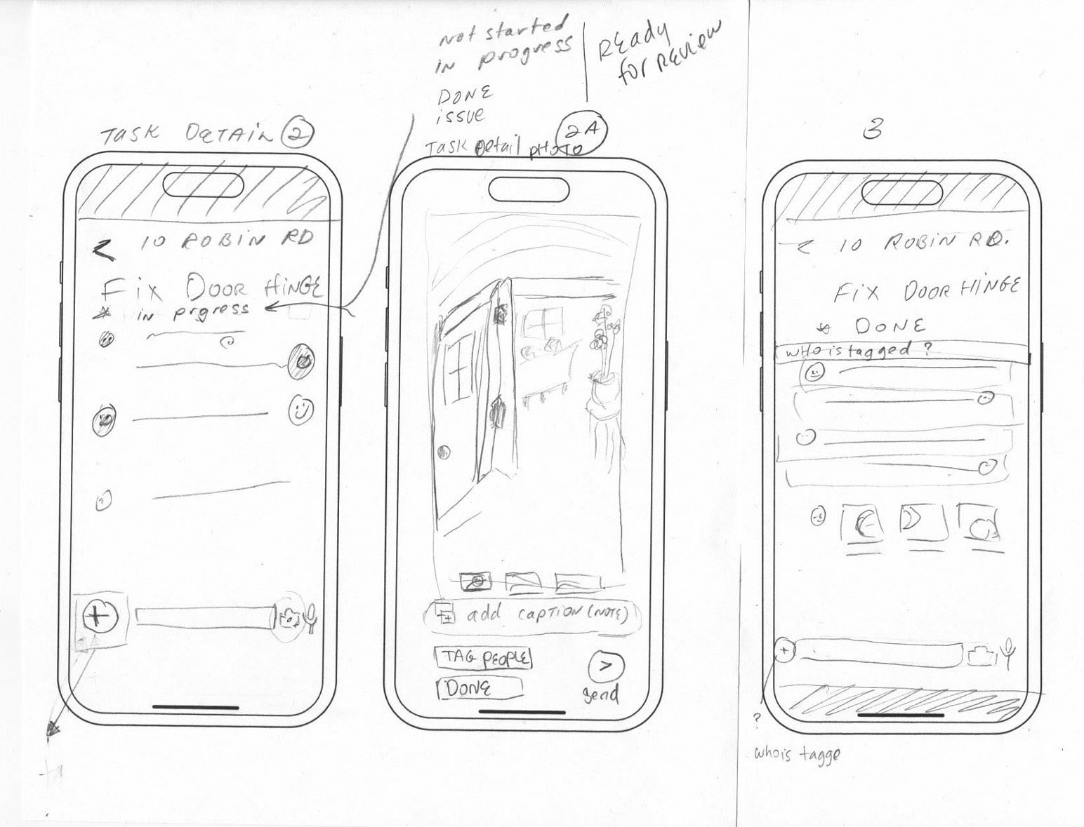
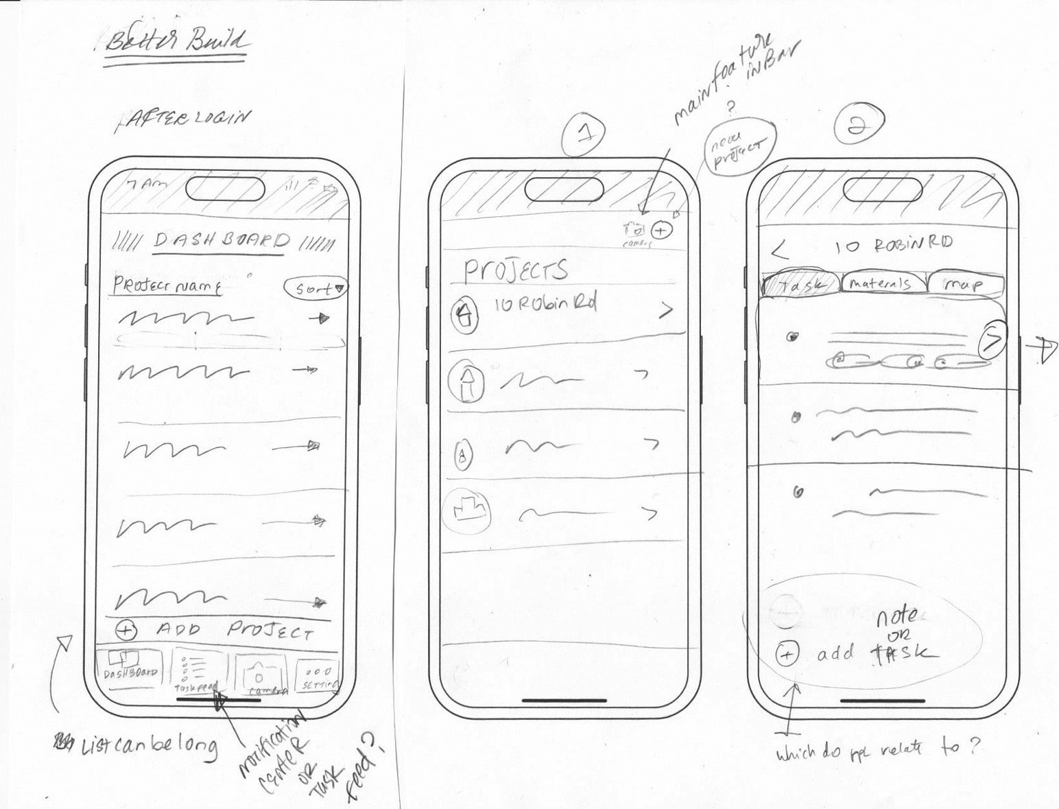
Insights on wireframes
Hands-on sketching helped explore design flows, providing a foundation before detailed work.
Lo-fi wireframes quickly uncover the user experience and help avoid over-attention on aesthetics, thus saving time and leading to quick iteration.
Lo-fi wireframes were useful for communicating with users and stakeholders.
User Interface Kit
Brand and UI consistency helps get the job done through a cohesive brand experience.
When a brand is consistent, it intuitively feels easier to use, and the information becomes familiar quickly. I chose a strong font with a low x-height for the logo to convey stability because this is crucial in construction, where trust must be built. I want users to feel confident that they can trust this brand.
I selected a light yellow for the logo, with vintage tones to create an impression of heritage. Additionally, there is a mint green that can be used to echo a sense of vintage style when necessary. For one of the primary colors, I chose a deep yet vibrant blue, symbolizing trust, strength, and energy. This shade of blue is calm and user-friendly, complementing another primary color that brings everything together. The Better Build’s UI library is designed to be a brand you can trust.
User Testing
Better Build's goal is to create an intuitive app that centralizes task management and communication for industry professionals. User and stakeholder feedback revealed user satisfaction & opportunities for enhancement.
I built and tested a high-fidelity prototype, leveraging Google Meet and Otter AI for user interviews and transcription. User testing is key to understand the products I build. Each test is an opportunity to discover unexpected findings—like a candy shop of insights! My lo-fi wireframing revealed user desires, including the need for project-centric chat tools.
Findings:

100% of the users were able to upload images easily

5/6 users were able to update the status of a project

All users (6/6) were able to easily write and send messages
Half of the users required additional navigational cues

33% found the time entry process straightforward

100% of users knew quickly where to check for notifications
Observation and improvements
During testing, the half-moon icon failed to convey its intended function, prompting its removal for clarity.
Half of the users utilized the chat feature yet expressed a need for project-specific chat channels, which will be designed and tested in future iterations.
To avoid information redundancy, notifications will be refined for conciseness.
Participants occasionally lost context within the app, indicating a need for clearer descriptive text and navigation cues to enhance wayfinding.
Usability testing and iterations insights
The importance of listening while testing. Each user described the pages providing me with another layer of understanding.
My unfamiliarity with the problem area brings both challenges and benefits; fresh perspectives for innovative solutions and the crucial need for thorough research and stakeholder collaboration.
Through testing I have uncovered insights to make improvements to the user experience.
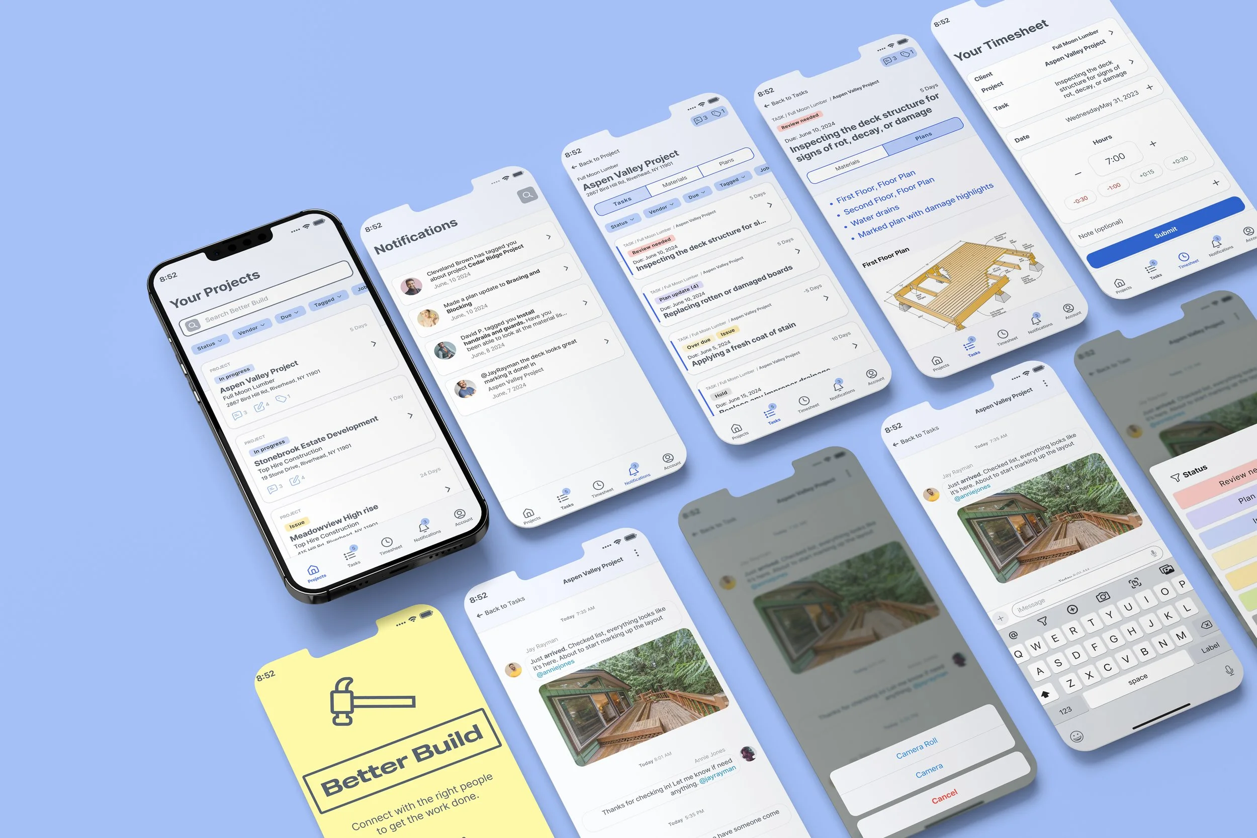
High Fidelity Interface Design
A major part of my learning during user testing was asking the users to talk out loud and share with me what they were seeing on each page.
It is crucial to understand the needs of the audience. This cannot be done without testing, discovering, learning and listening.
Iterating of the Fittest with User Feedback
Through user testing, I found the app was user-friendly—but observed users and recorded feedback that highlighted opportunities for design experience improvements.
Dashboard Update Summary:
User journey now begins with projects, not companies.
Search bar visibility improved.
Project page now clearly sorts and filters for immediate user access.
Project cards are more robust for quickly seeing the information.
Timesheet and Task View added to navigation for enhanced time reporting and notifications.
Your Tasks (added page)
Added tasks to the nav bar clearly marked at the top of the page to show you where you are. Testing found that the current state matched too closely to other pages and that a page showing potential tasks for other projects could be well received.
Search bar visibility improved.
Filter state.
Showing what the filter state would look like.
Improved cards with more information for quickly understanding what is happening.
Tasks for project // After user testing
Each project now has its own conversation. You don't have to filter through each task to find the conversation.
More efficient way of locating: company, project, and address added to the top of tasks for the specific project
Improved cards with more information for quickly understanding what is happening.
Task Detail
At first it was one chat per task, now it is one chat per job with a tag to indicate if you have been mentioned.
Information pertinent to current task.
Task view now has a toggle between materials and plans.
The project manager is able to add documents to the plan and you can quickly review the per-task information.
Notifications
Sort and filter was removed due to over-complication.
Simplified notifications now help easily direct user.
Keep on Discovering
Iterations made to the app have greatly improved functionality and user testing is important to the development thus far. I am fortunate to have been able to test this app. Without iterating and talking to real users, Better Build would miss the mark on truly understanding and solving for user needs.
Reflections
A standout experience for me with working on Better Build was integrating a familiar pattern such as the group chat feature into our app.
All in all working on the Better Build project was insightful and rewarding. It was great to talk with experts in the field and to help stakeholders get one step closer to their dream construction management app.