
Tiny Buddha Yoga
Be here now—a welcoming yoga community.
Responsibilities | Interaction Design, User Research, Responsive Web Design, Prototyping, Informed Iterations
Timeline | 4 Weeks
Client | Tiny Buddha Yoga
My Role | Branding, User Experience Design & User Research
Tools | Figma, Illustrator, Otter.ai, Photoshop, Google Meet, Figjam
Problem
Current website is inconsistent, does not fully reflect the brand's personality—and would benefit from improved story telling and way finding.
The current website slows user engagement and growth potential by not being an intuitive and welcoming experience. My challenge is to develop a new website—aligned with client goals—which emphasizes the user’s experience, content clarity, and brand integration for seamless navigation and expansion.
Goal
Refresh website for brand consistency.
Enhance online experiences.
Elevate the narrative.
Solution
Informed by interviews, the Tiny Buddha Yoga website redesign prioritizes community building, improved class scheduling access, storytelling, and streamlined communication. This involves intuitive user flows, optimized scheduling, narrative highlights, and clearer contact options aiming to elevate user experience, foster growth, and fortify student connections.
Competitive Analysis
Discovering the important role of yoga in students' lives.
I conducted a thorough competitive analysis, expanding beyond the yoga community into related industries. This highlighted my client's unique brand identity within their community.
Through this analysis and user interviews, I discovered that yoga entails more than just classes—it's about creating a studio experience, offering comfortable guidance, and diverse class options. This emphasizes the importance of welcoming imagery and a tranquil atmosphere for an enhanced user experience.
During my evaluation of user experience, I noticed various platforms had the following:
Intuitive navigation
Inviting, warm imagery
Lifestyle-centric approach
Note: To maintain privacy, specific company names and details from the competitive analysis have been excluded.

Insights
User-centric design elements
Create a welcoming environment
Facilitating ease of use
Easy-to-use navigation and prominent calls to action
User Interviews
While interviewing users, I discovered that individuals prioritize a welcoming, community-oriented yoga studio with easy sign-up processes and accessible class descriptions over other environments.
Objectives
Learn how individuals choose yoga studios.
Identify user preferences when navigating studio websites.
Determine essential interactions and supporting materials for effective engagement.

“I've always been, like, a person who uses exercise as a way to get to connect with the community.”
— Interviewee

83% of interviewees prioritize a welcoming, community-oriented experience where they can learn about the studio's story and make positive first impressions from the site upon arrival.

83% of interviewees rely on Google reviews to gauge the studio's reputation within the community.

100% of interviewees value easy access to class information, easy sign-up processes, and convenient cancellation options.
“...finding spaces where you're allowed to just be you and show up as you are and that is expected and accepted is, like, everything.”
— Interviewee
Insights
Participants prioritize yoga studios with welcoming, community-oriented atmospheres.
Clear communication of the studio's story and class offerings is crucial for creating this environment.
Facilitating easy booking processes enhances user experience and promotes a sense of care and consideration.
Affinity Mapping
The sense of support and community when engaging with a yoga studio was the highest value aspect for users.
Users expressed loyalty after visiting a new studio multiple times and feeling like they were recognized as familiar faces.
Users rely on Google reviews to inform their decisions when selecting a yoga studio, suggesting an area of improvement for businesses to focus on.
Insights
Through interviews and reinforced via affinity map analysis, I discovered the significance of community within yoga studios, with users expressing a strong desire for connection and support.
Users prioritize the importance of providing a safe and comfortable environment for practicing yoga, promoting physical and emotional well-being.
Additionally, users seek to learn about the studio's story as a means of connection and information, underscoring the role of storytelling on the site.
Users Perspective
Students prioritize easy class sign-up, sense of community, and Google reviews when considering a yoga studio.
Understanding user perspectives enabled me to empathize with the diverse emotions of navigating new environments. Acknowledging the significance of clear information and fostering comfort, I tailored the site's design and content accordingly leading to improvements like clearer sign-up prompts, more visuals showcasing the community, and better articulation of class offerings.
POV
Casey and Sage need to have an open & friendly way to ask questions or request modifications, without feeling as though they are being judged.
↓
HMW
How might we create a platform or system that encourages Casey and Sage to freely ask questions and request modifications, ensuring a supportive and non-judgmental atmosphere within our studio community?
POV and HMW Insights
By focusing on the user's perspective, I gained valuable insights into their needs, which served as the guiding force for the redesign of the yoga website.
Empathized with diverse user feelings about entering new environments
Recognized the necessity of clear and concise information for navigation
Adjusted site design to enhance usability focusing on easy discoverability and showcasing studio uniqueness
Users Personas
Users want flexibility, easy scheduling and a place to practice with many skill levels
Personas were crafted representing diverse perspectives reflecting Yoga's ethos of continual learning. The site will emphasize self-paced learning, ensuring inclusivity and welcoming all to practice and participate.

Casey Finley
Age: 40
Education: Bachelors
Status: Married, 2 kids
Occupation: Sales Manager
Location: Illinois
Tech Literate: High

About User
Casey has a fast-paced lifestyle, balancing career and parenthood. She prioritizes self-care alongside professional and parenting responsibilities.
Core Needs and Goals
Requires a schedule that seamlessly fits into her busy life.
Values easy sign-up processes for efficient participation.
Seeks a welcoming space she can regularly revisit.
Frustrations
Sites are not always clear about the offerings, taking extra time to find what she needs.
Feels intimidated in new spaces, impacting her comfort level.
Difficulty feeling comfortable in new studios and classes at first.
“I can go at 6am. This is fantastic! After or before work. It’s an amazing schedule.”

Sage Parker
Age: 35
Education: Bachelors
Status: Single
Occupation: Researcher
Location: Arizona
Tech Literate: Learner

About User
Sage, a dedicated researcher, spends most of her time in front of her computer. When not immersed in research, she finds joy in movement and learning skills.
Core Needs and Goals
A place with a sense of community, providing a supportive environment.
Access to classes that cater to varying skill levels.
Teachers who empathize with and understand her needs and skill level.
Frustrations
Feeling like she's constantly starting from the beginning because she lacks a consistent practice.
Self-consciousness, and shy in new spaces.
Uncertainty about which yoga class suits her skill level.
"I feel like I’m forever kind of a beginner because I get really into yoga, stop practicing and then I get back into it and stop again.”
Insights
Identified user levels, insights and and necessary accommodations.
Directly informed site development to cater to new and returning users.
Acknowledged differing user preferences: some prefer direct class access, while others prefer exploration and connection-building on the site beforehand.
User Flow
Booking a class was one of the more important features that had to be easy to find & navigate to.
Explored various user flows and iterated on navigation design through testing to enhance user experience.
Identified issues with booking class visibility and cumbersome navigation from a business standpoint.
Implemented a mobile-friendly navigation approach to streamline access to site features across different devices, with plans for preference testing in the future.
New and returning student user flow

Insights
Comprehensive site map and user flows provided foundational steps in the design process, enabling seamless transition to low-fidelity (lo-fi) and high-fidelity (hi-fi) designs.
Identified the value of detailed specifications in enhancing communication between designer, developer, client, and user during testing, ensuring clarity and alignment in the design process.
Prioritized specificity in design iterations to visualize interactions accurately, fostering clearer communication and facilitating more effective testing and feedback loops.
Interaction Design Lo FI
Qualitative data helped to validate the need to simplify the class signup process and other studio touch points.
Interviews with both current and perspective students revealed the importance of making touch points more approachable. These included:
contact (email specifically)
class level descriptions
whether or not a class was “hot yoga”
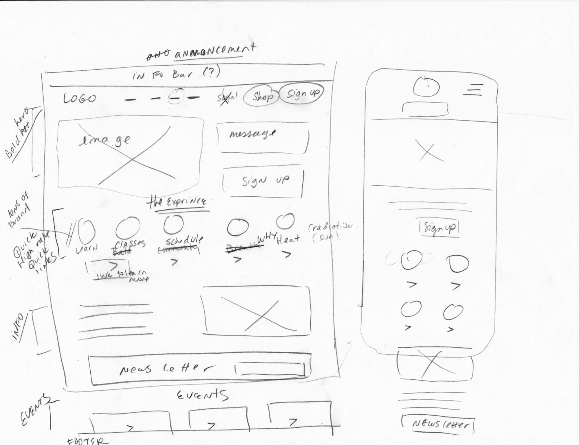
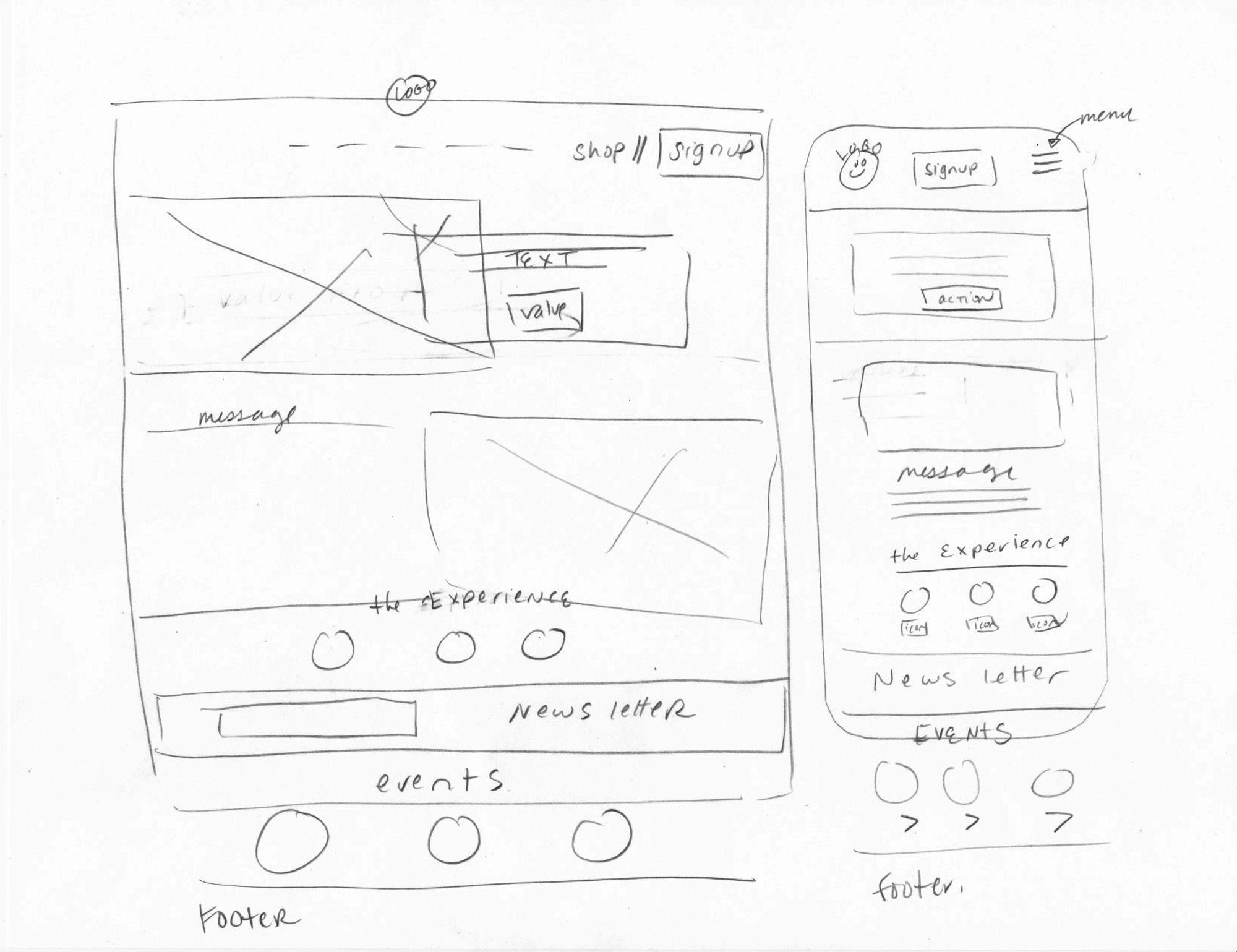
Insights
Aided steps toward understanding general placement of information and calls to actions.
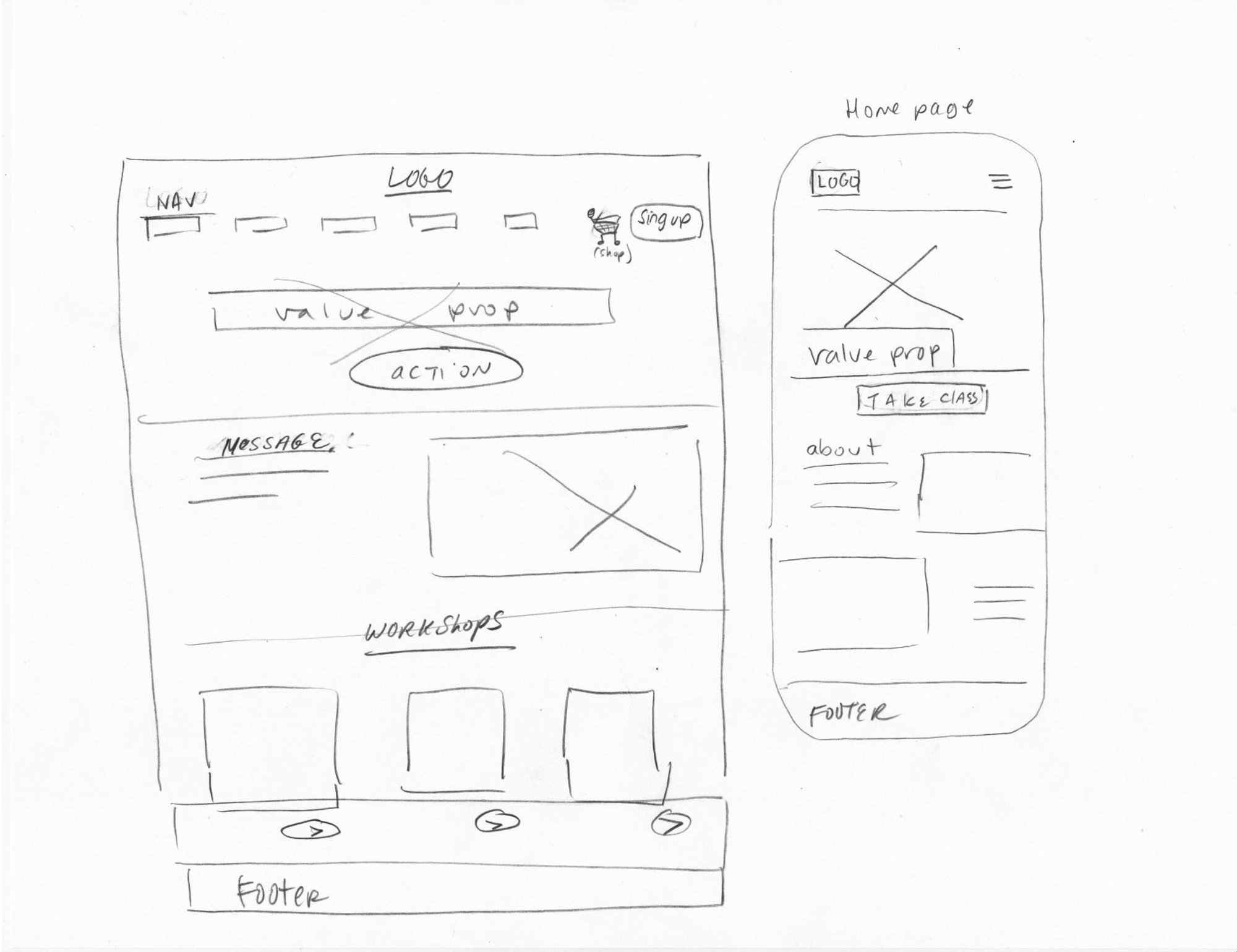
High Fidelity Mock ups
User feedback enabled a more authentic enhancement of community-feel, with brand-essence photography, a persistent "Book a Class" button, and improved page descriptions to inform the user.
User Testing
Moderated and unmoderated User Testing helped guide clarification of content & flow.
Ongoing journey: Understanding the yoga studio user’s needs is fluid, demanding continual improvement.
Connection: Users increasingly seek human connection and community within the studio.
User-Centric Approach: Incorporating user insights is vital to meeting information and community needs effectively.
Added easy call to action
The call to action - book a class - required prominence as well as studio story in order get a sense of personality
Easy to understand class information
Difficulty levels, class temperature and duration were clarified.
Better read and scalability
Ability to see multiple teachers at once, gain a sense of personality including music play lists and navigate within individual bio pages with less scrolling to reduce cognitive load.
Insights
To meet the demands and expectations of both users and stakeholders would not be possible without the direct participation of both parties in the development process. Strategies for gaining their vital feedback are essential.
Reflections
This project was both rewarding and challenging. The redesign and improvement of an existing platform required extensive iteration. The process revealed a unique set demands from both stakeholders and users. User research was essential in providing critical insight into the expectations surrounding a yoga studio. In an environment as competitive and diverse as the fitness/mindfulness industry, first impressions are paramount. It is therefore crucial to communicate specific information clearly to potential clients while appealing to their highly attenuated aesthetic sensibilities. I'm excited to continue refining the site, updating visuals and enhancing social media presence.
